Overmorrow
- An online platform to share thoughts about death
Overview
Throughout my life, I've always felt that life is vulnerable - people died in Ethiopian Plane Crash, in COVID-19, and in many other unlisted accidents. What touched me is that, despite the vulnerability and uncertainty, the whole human race continued to grow and reborn from these tough moments.
Martin Heidegger once said, "If I take death into my life, acknowledge it, and face it squarely, I will free myself from the anxiety of death and the pettiness of life - and only then will I be free to become myself. ”
As I lived away from my parents since the age of 15, I always fear of accidents and my own death. I wanted to find a way for people to share thoughts on the issue and live a meaningful life. Thus I initiate the project, Overmorrow, for people to express their inner feelings towards death and what they learned through their personal experience.
adviser
team
contributions
User Research; UX Design; UI Design; Motion Design; Branding
duration
3 months
skills
User Research, Wireframing, Information Architecture, Prototyping, Figma, Miro, Principle
Approach
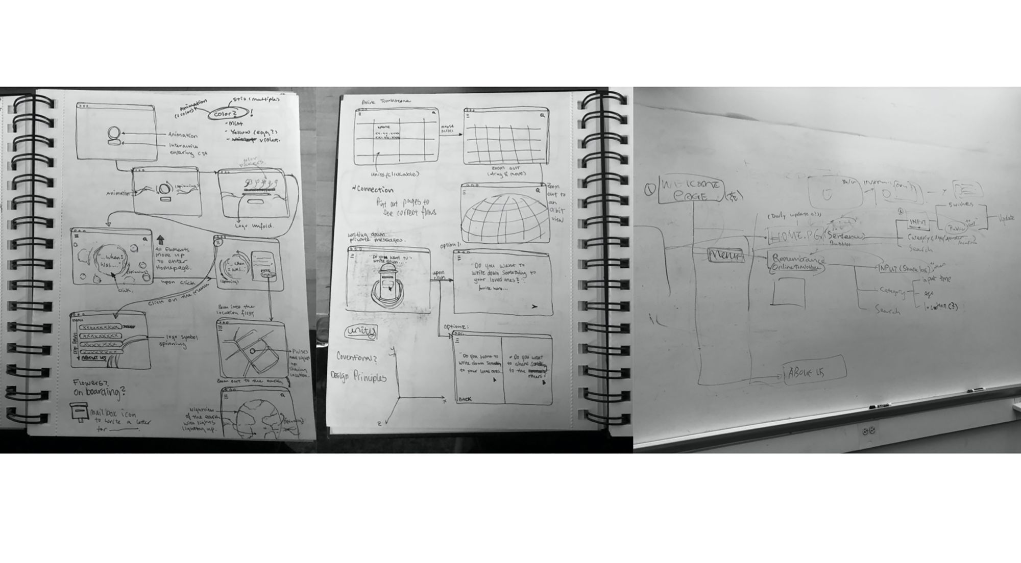
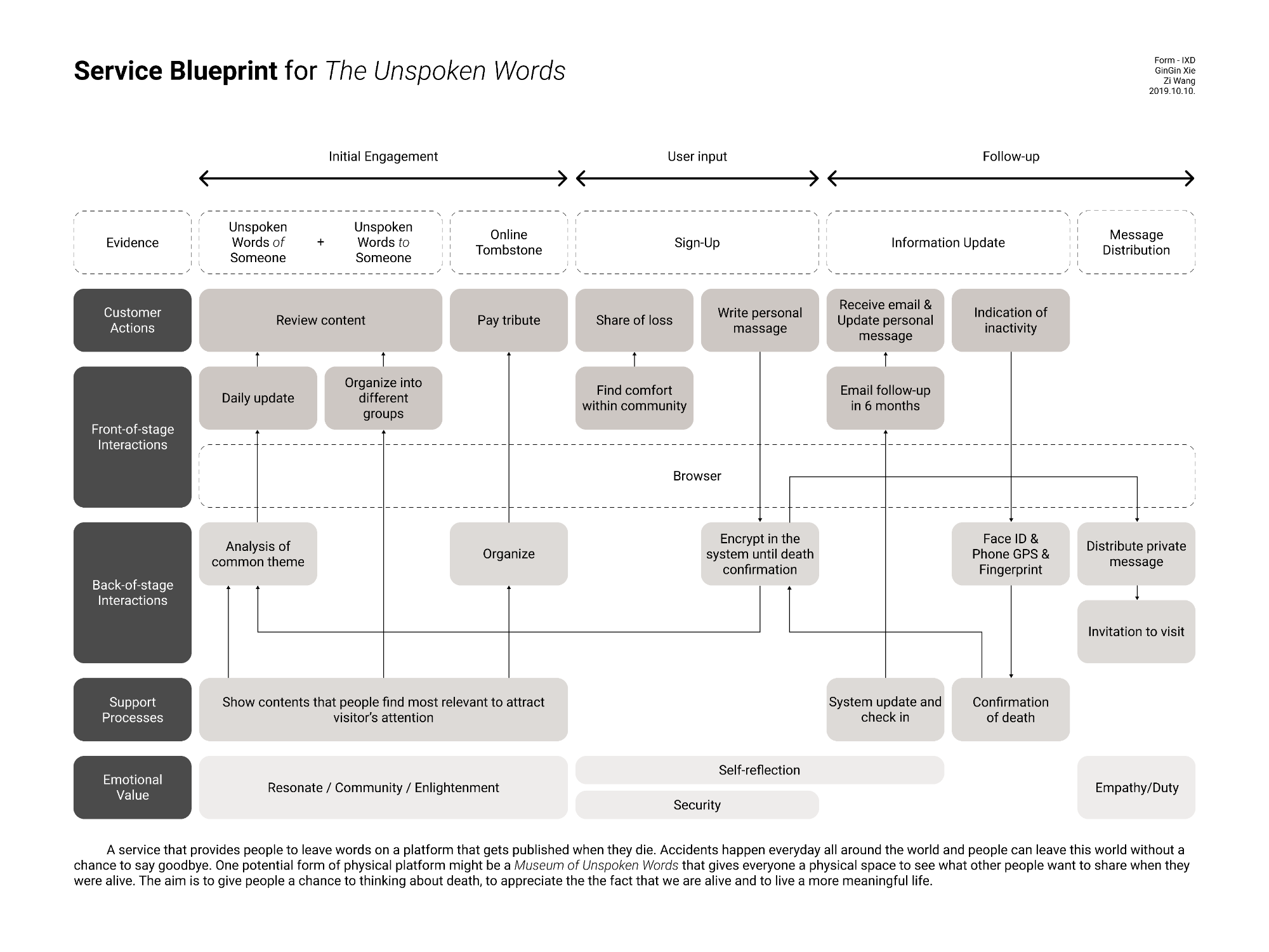
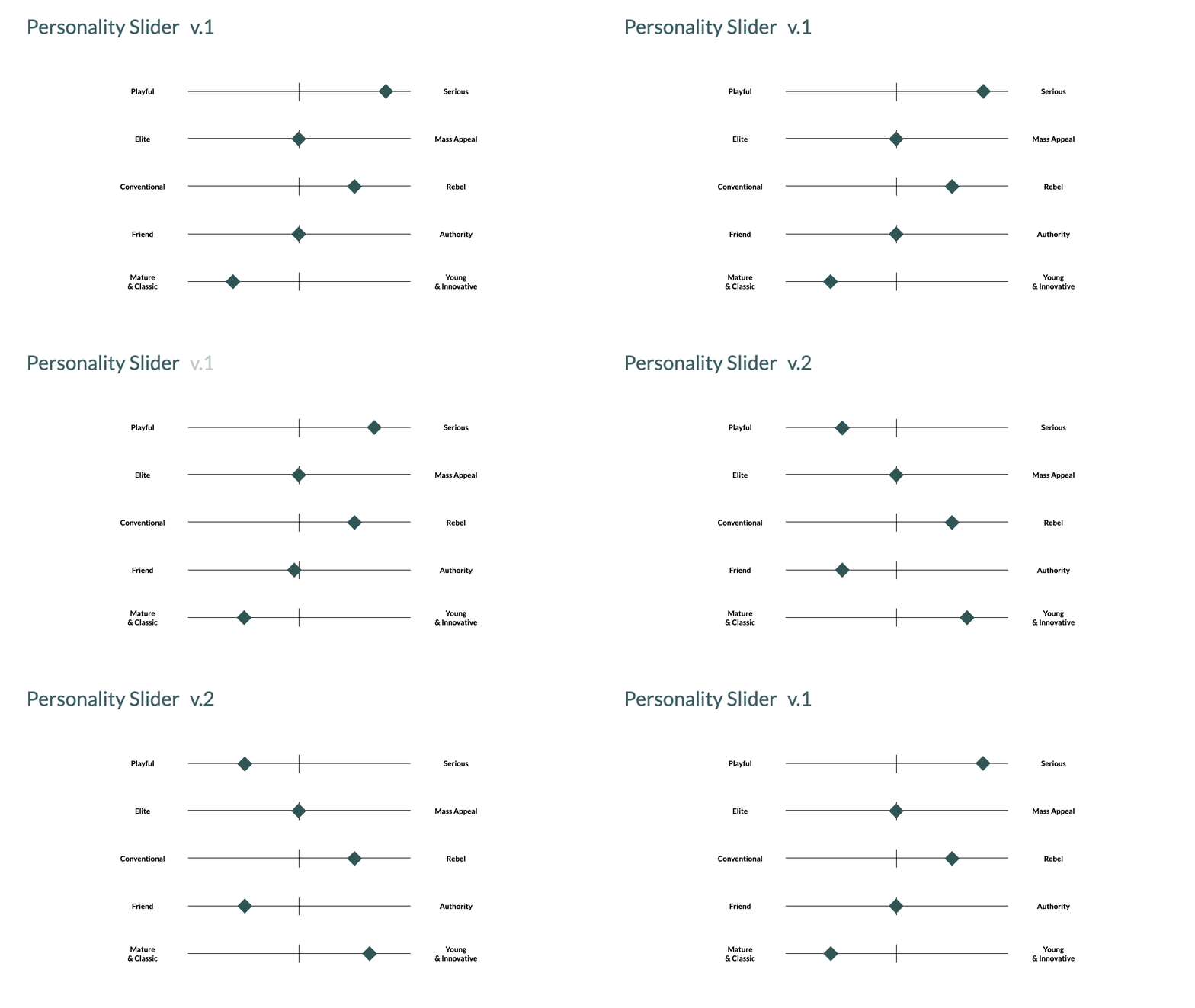
The project started with a product hypothesis in the form of a service blueprint. We narrowed down the project focus through interviewing our target audiences and iterated the overall branding including moodboards and the company personality slider. The research helped us to validate some of the ideas and pivoted away from the undesired feature. We started on the design of the company brand and the wireframes based on the interview feedback. The in-progress low-fidelity prototypes were tested for usability and we then arrived at the final deliverables include a landing page and a complete design system UI kit.

service blueprint
The initial concept was called "The Unspoken Words". It is a platform for people to leave words both to the public and to their family in the case of their death.
All messages will be encrypted until death confirmation. In the event of death, the private messages will be delivered to the intended recipient while the public messages will be shared on the platform.
Target Audience
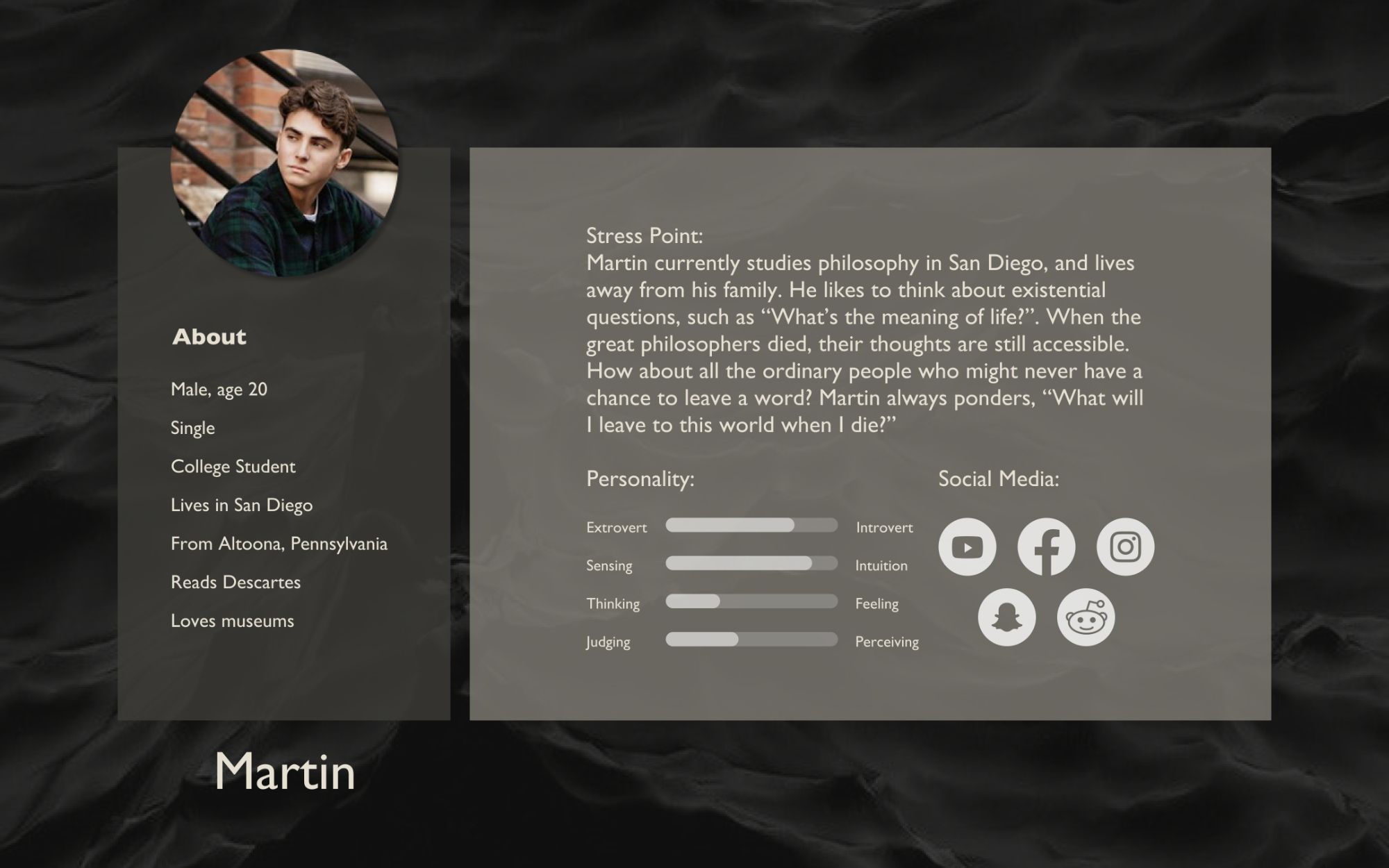
People living alone and away from their loved ones.
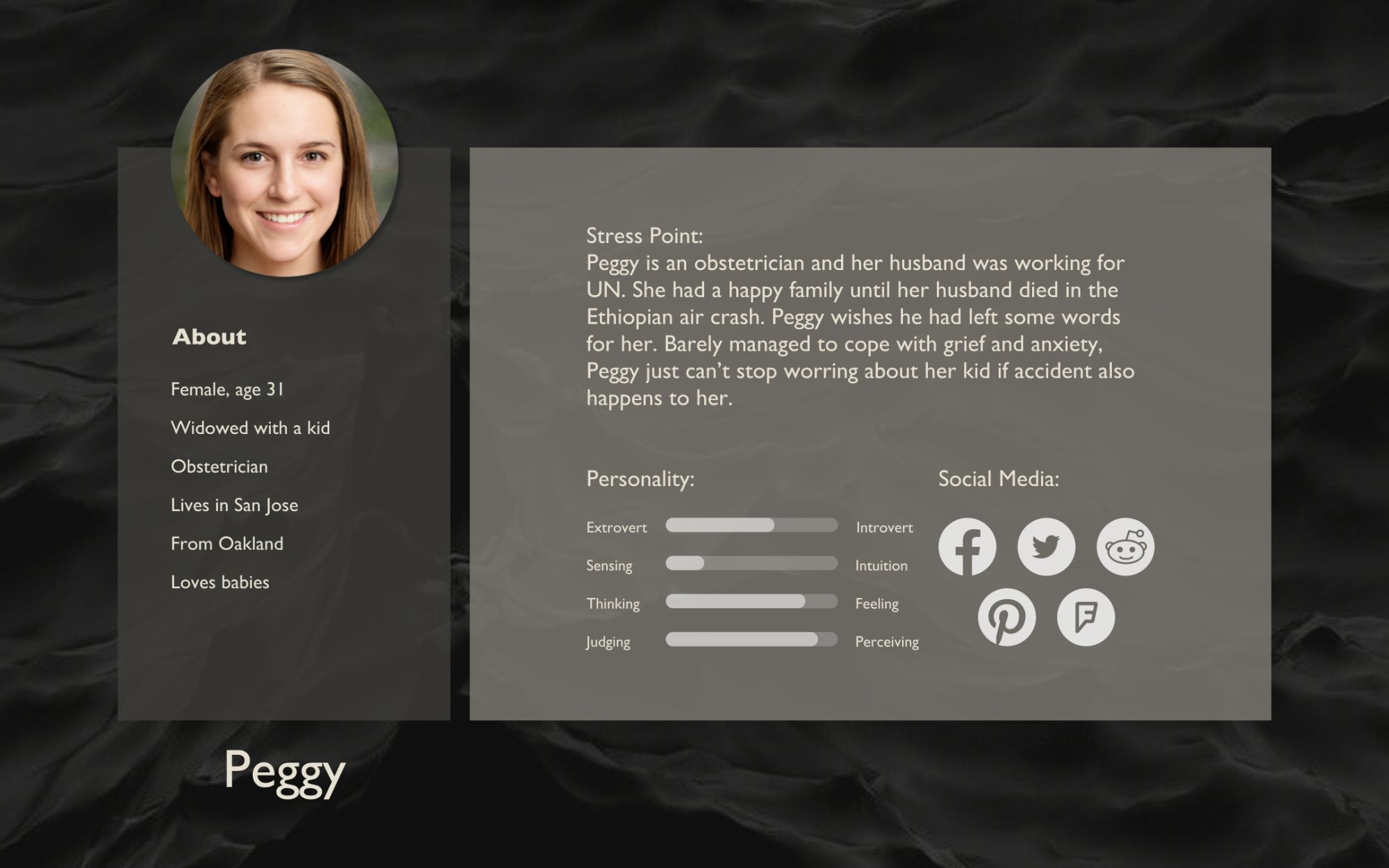
People whose loved ones died in unexpected accidents.
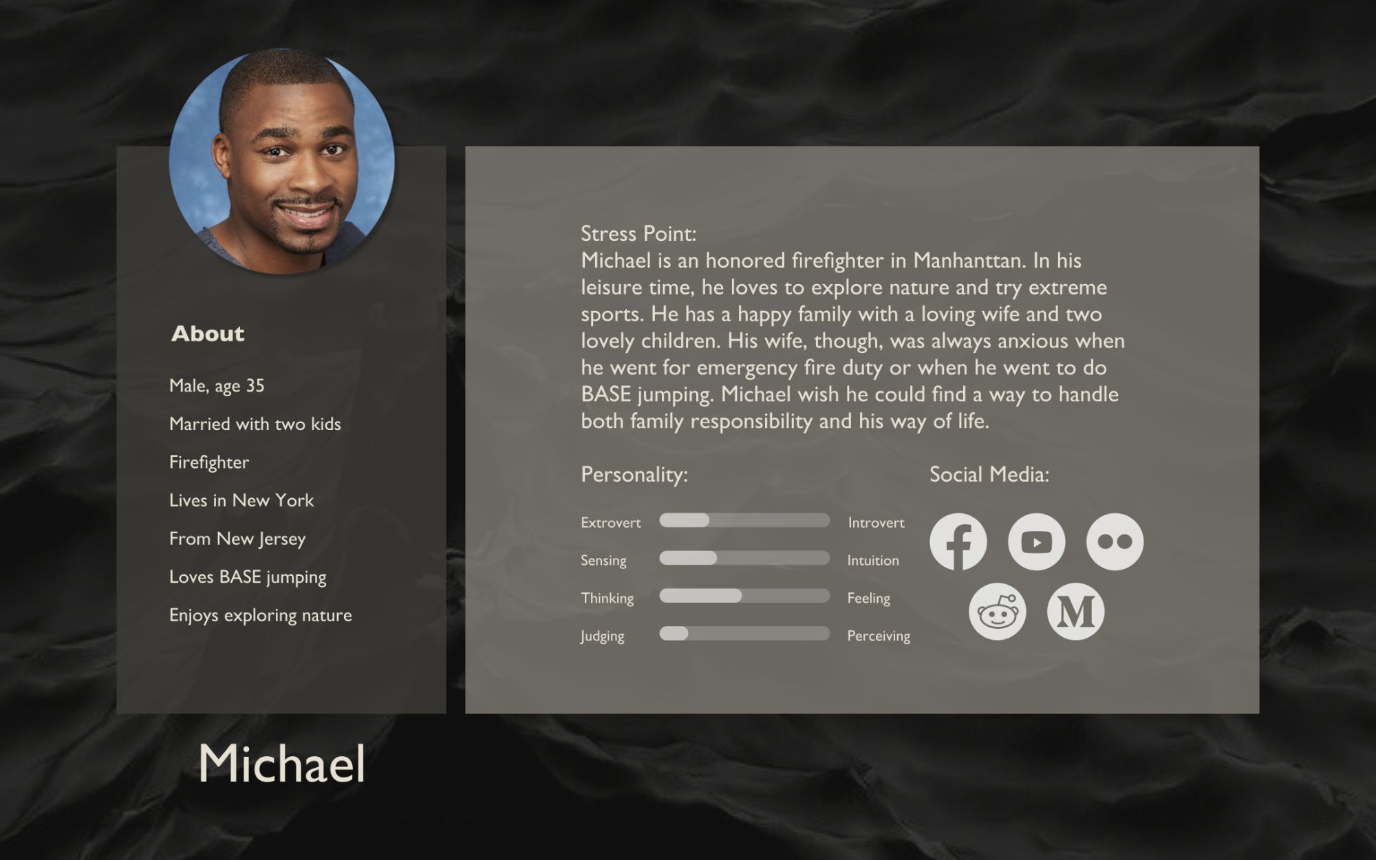
People involved in high-risk activities. Such as firefighters, extreme sportsman.
Persona
Three personas were constructed to illustrate the three user types who are most interested in the discussion of death.
The personas helped us to understand the goals and needs of the potential users of the product. As part of the research process, we reached out to people who match the target audiences to learn about them.
Interview Insights
"Death is a sad topic, black color made me feel worse."
“I’m really excited about this concept and I think it is very meaningful”
“I might not want to think about my own death yet, but I definitely learned something from the incident.”
pivot
Based on our feedback, we made two important pivots. First, the stories shared on the platform will no longer be the last words in case one dies but will be something a person learned through their encounters with death, including their own life-threatening experience or the death of their loved one. Second, the overall theme will move away from a dark monochrome feeling into a more playful theme so that people will view the stories as a way of encouragement and inspiration.
opportunity
"How might we encourage people to live fully by sharing their memories, their fears, and their conciliations towards death?"
design values
Enlightenment
Connectedness
Relief
name and logo
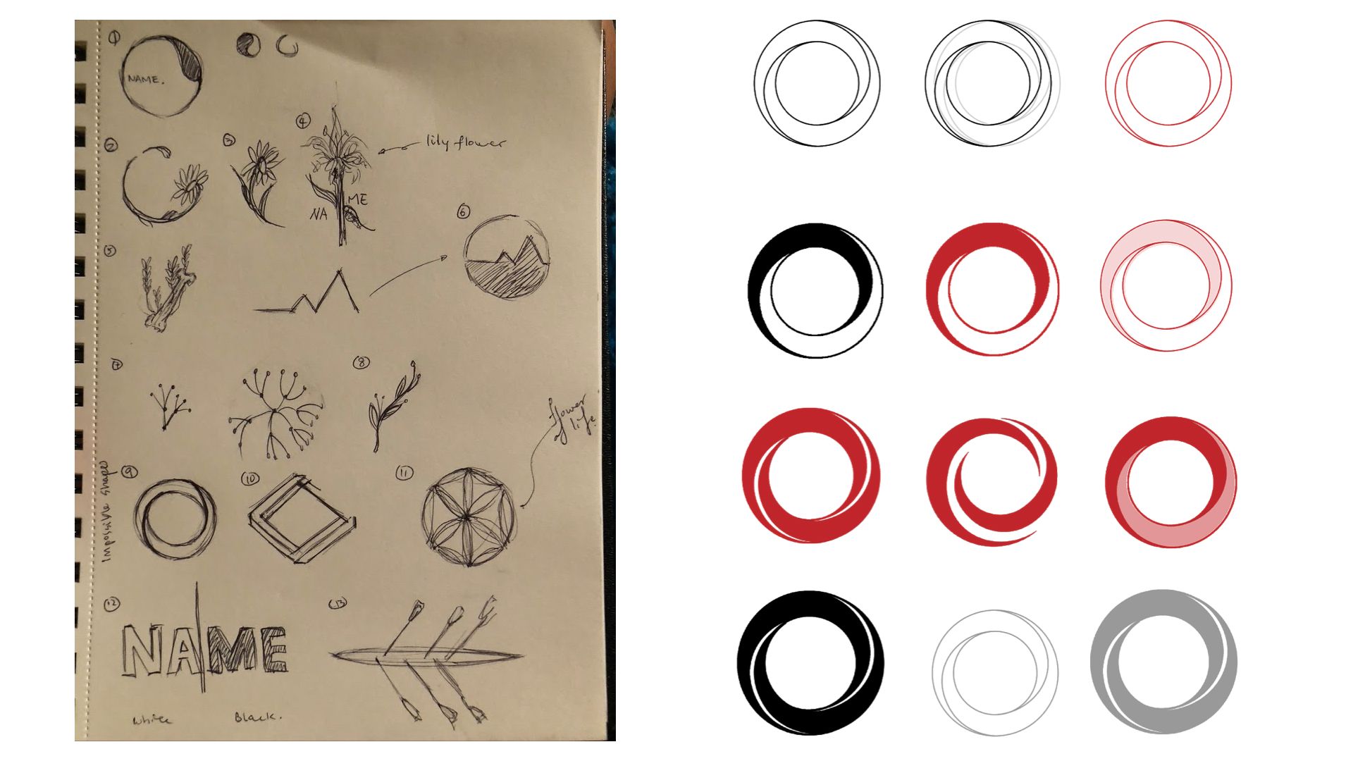
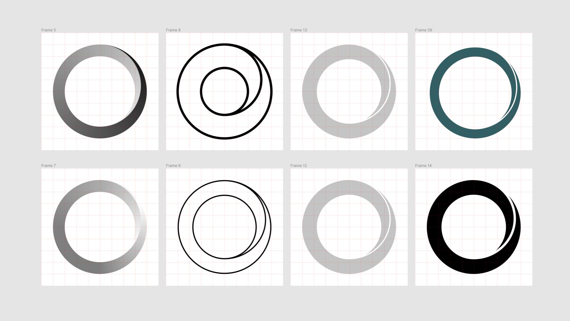
The logo is inspired by Mobius strip and it represents the connection between life and death. The final shape underwent several design iterations to become simple yet elegant.
The word "overmorrow" came from obsolete English which means "the day after tomorrow". For people who had a traumatic experience, it encourages them to move forward; for people who want to be inspired, it encourages them to acknowledge death in their life and free to become themselves.

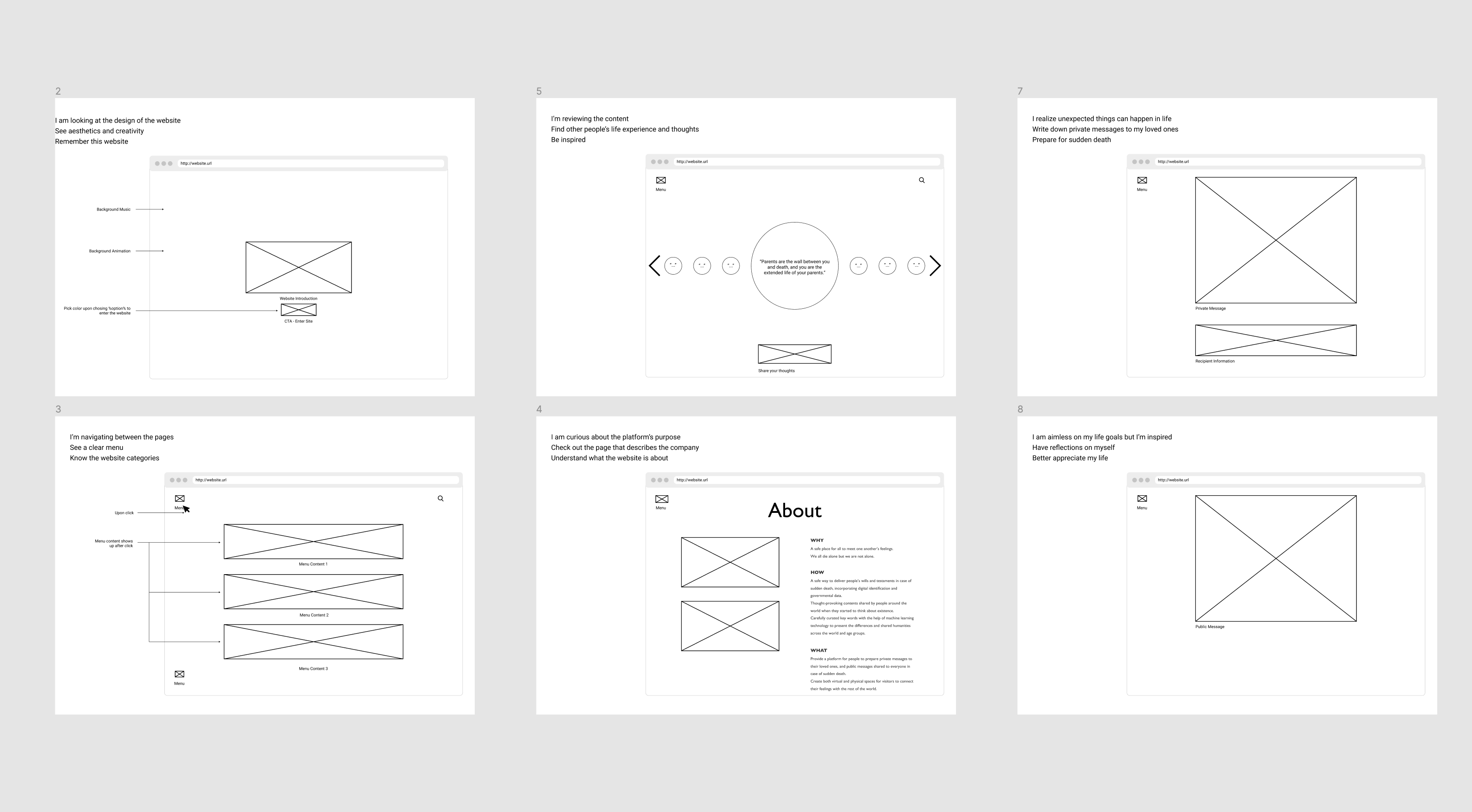
WIREFRAMES AND LOW FIDELITY PROTOTYPE
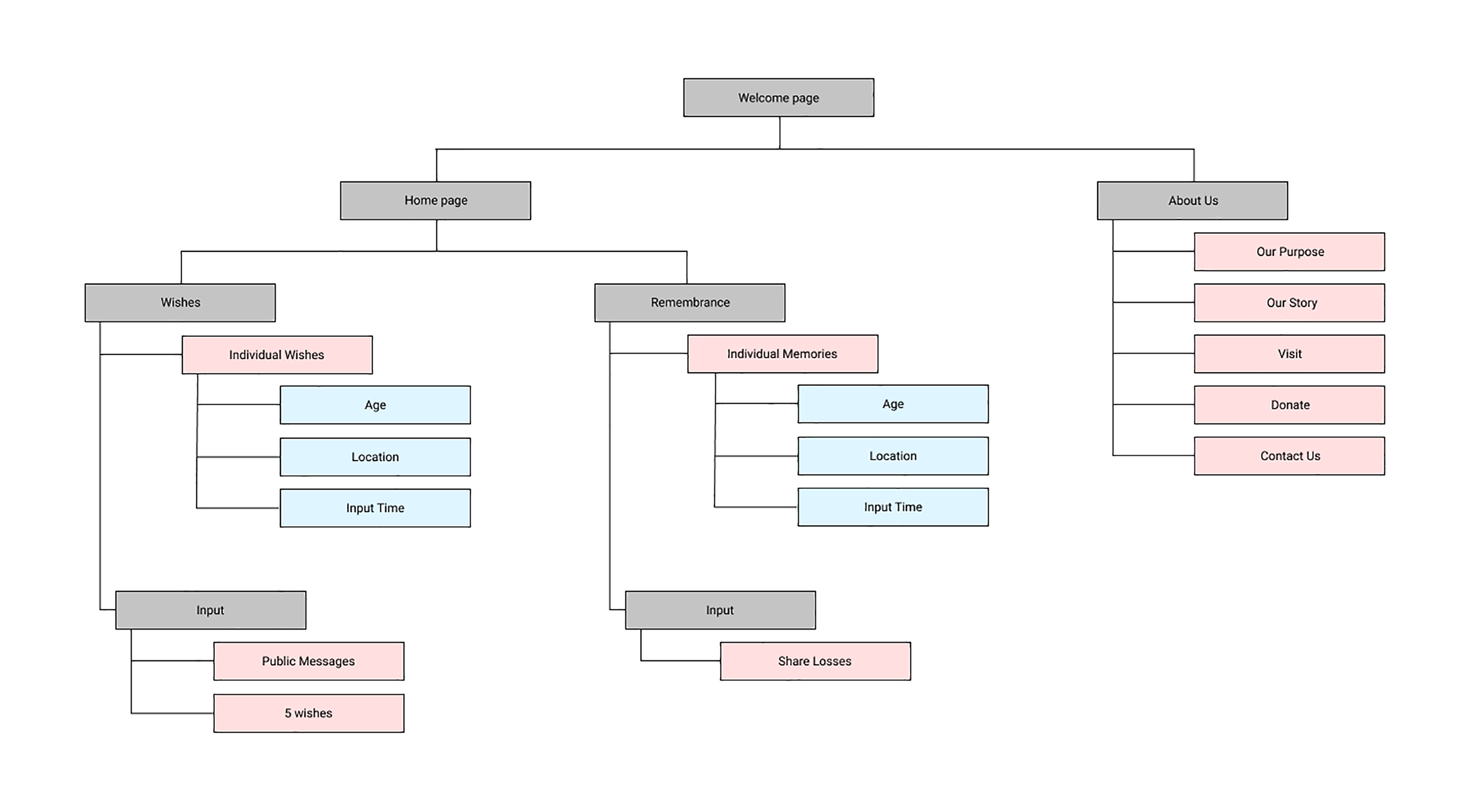
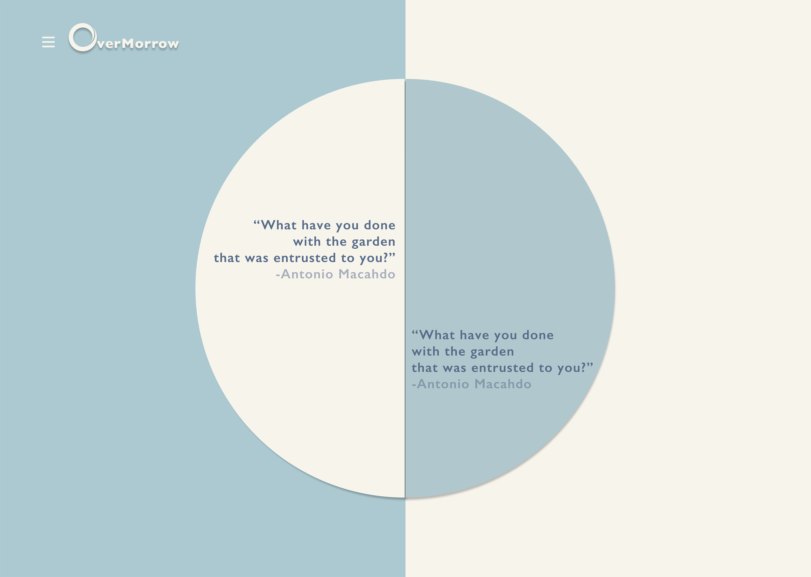
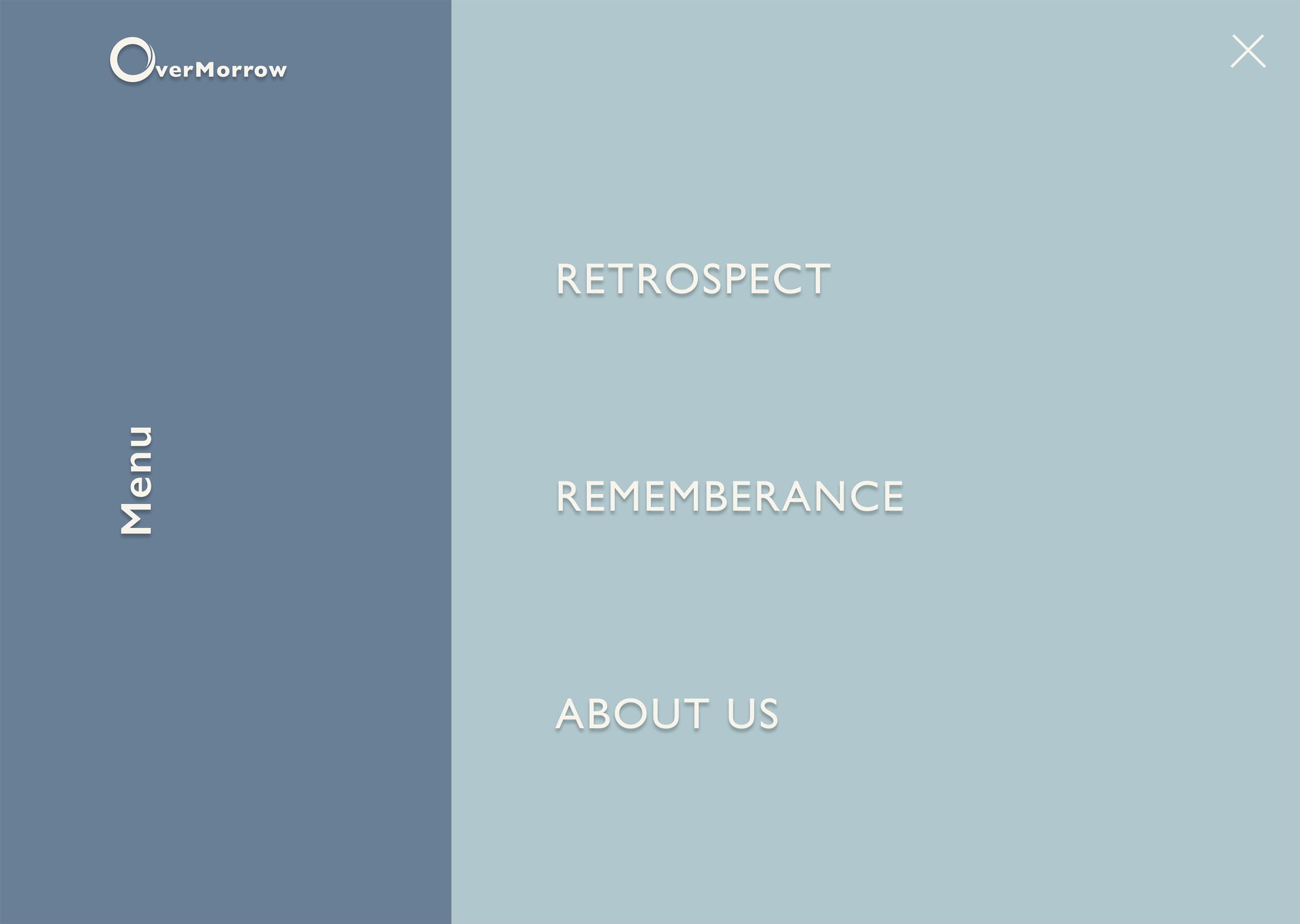
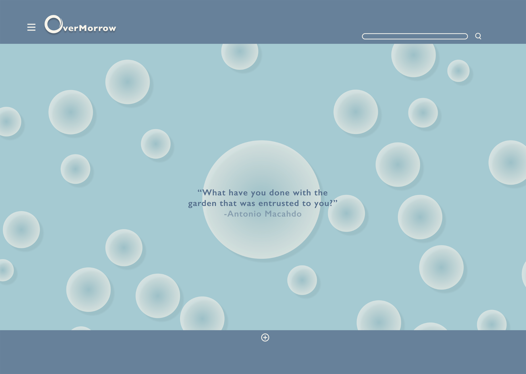
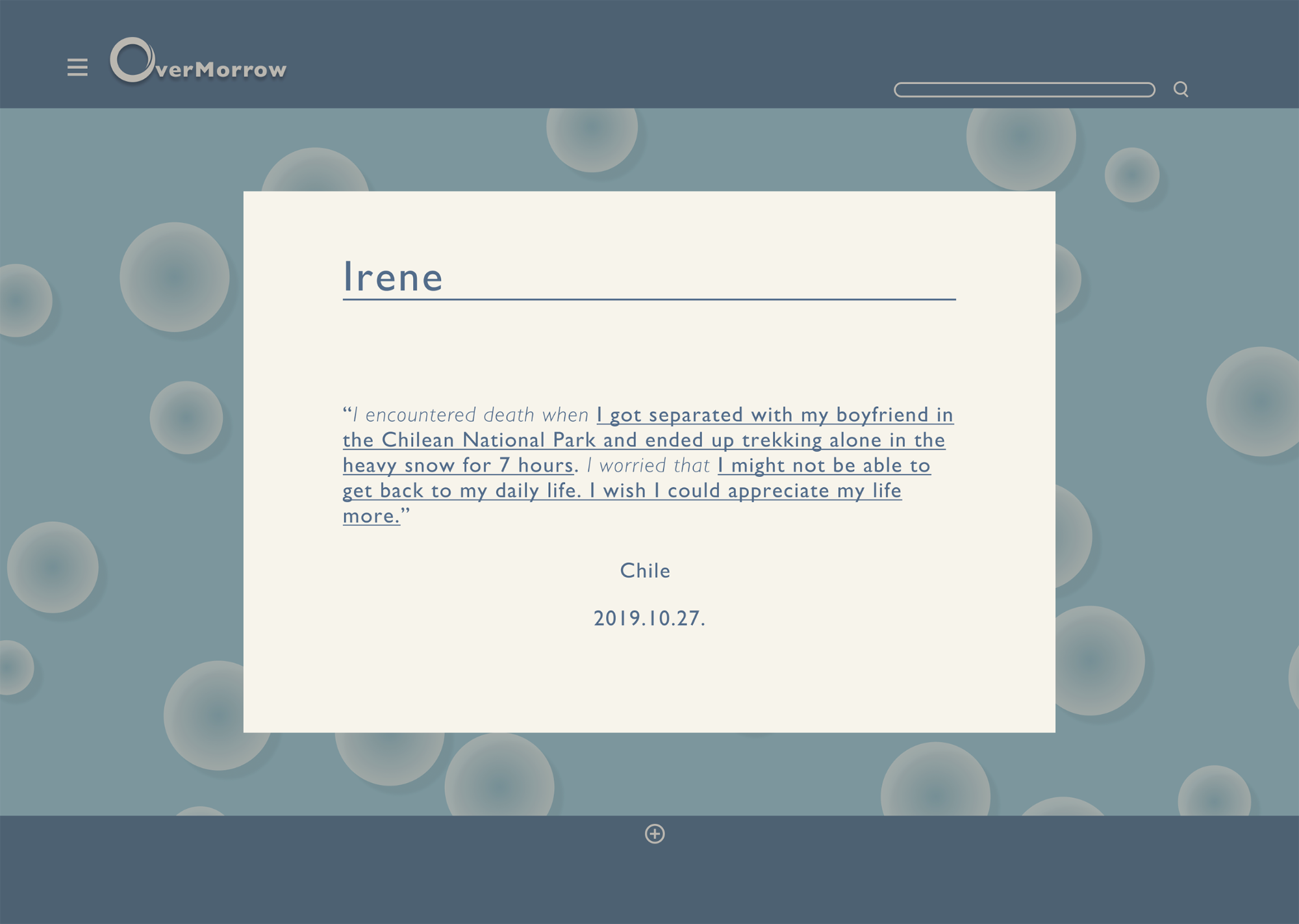
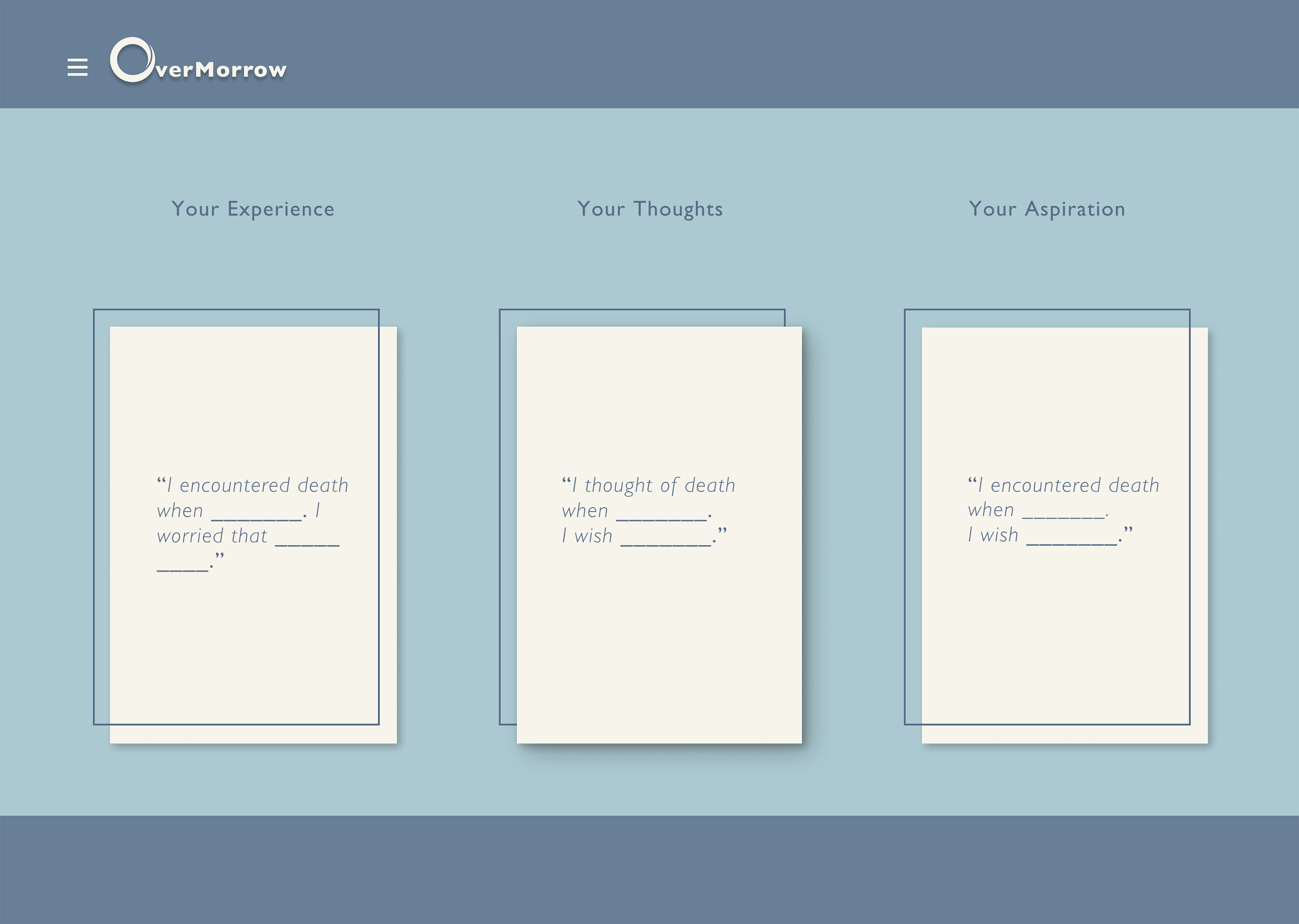
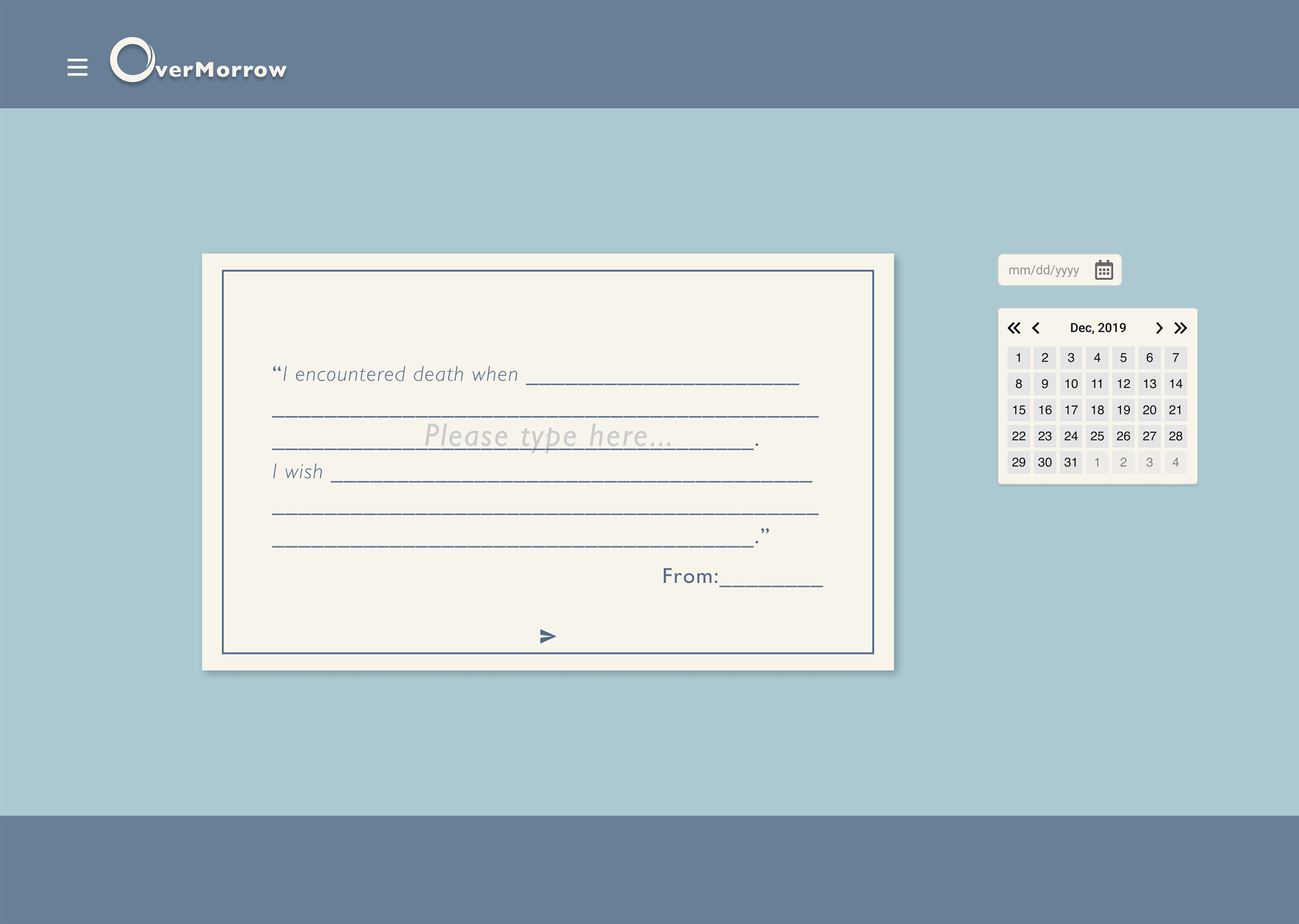
As we defined the opportunity space and the company branding, we dived into the design of the actual platform through information architecture, wireframing and low-fidelity prototyping.
USABiLITY TESTING
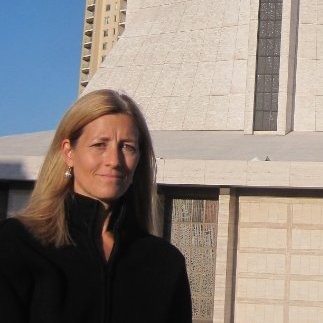
We reached out to Mara who hosted the Death Writing Group in California College of the Arts and received wonderful feedback for our prototype.
One key insight we learned from her is the importance of setting the context for the user of what the platform is about before they start sharing.
*Mara Holt Skov is a San Francisco-based educator, author and curator. She is particularly interested in rising macrotrends in design and visual culture, interdisciplinary teaching and learning, and design for human needs especially health, wellness, and end of life issues.
final deliverable
As part of the final deliverable, we designed the landing page that tells the story of the platform to engage users, the input page that encourages people to share their stories, as well as the about-us page that introduces the project and the team.
The final design incorporates custom-made illustrations and a carefully-curated parallax scrolling effect that help people to learn about the purpose of the platform and to gain trust in the sharing process.
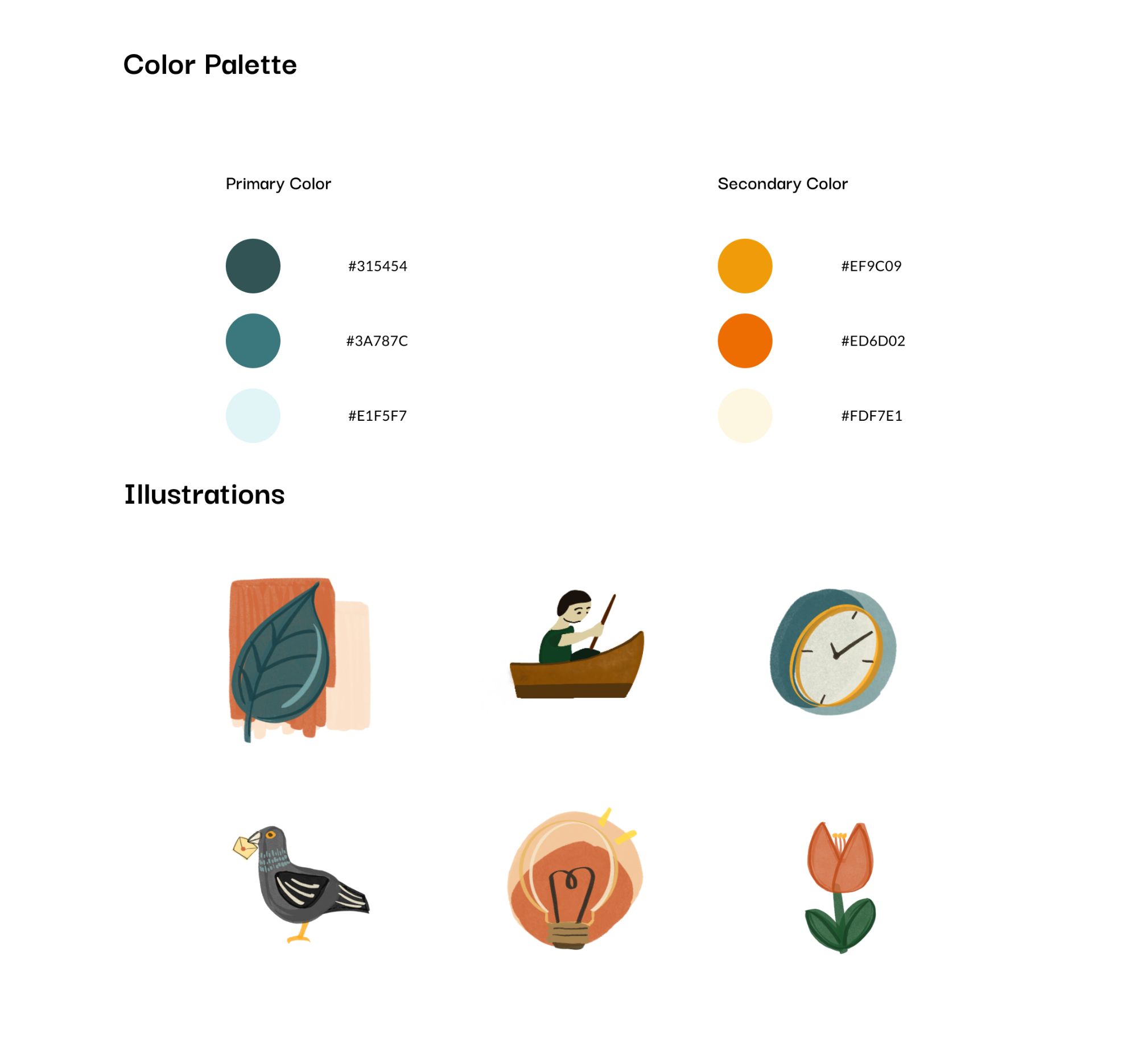
color and illustration guide
A combination of earthy colors were selected to convey a warm feeling for our users. And a set of illustrations was created by Gingin to support the overall website presentation.
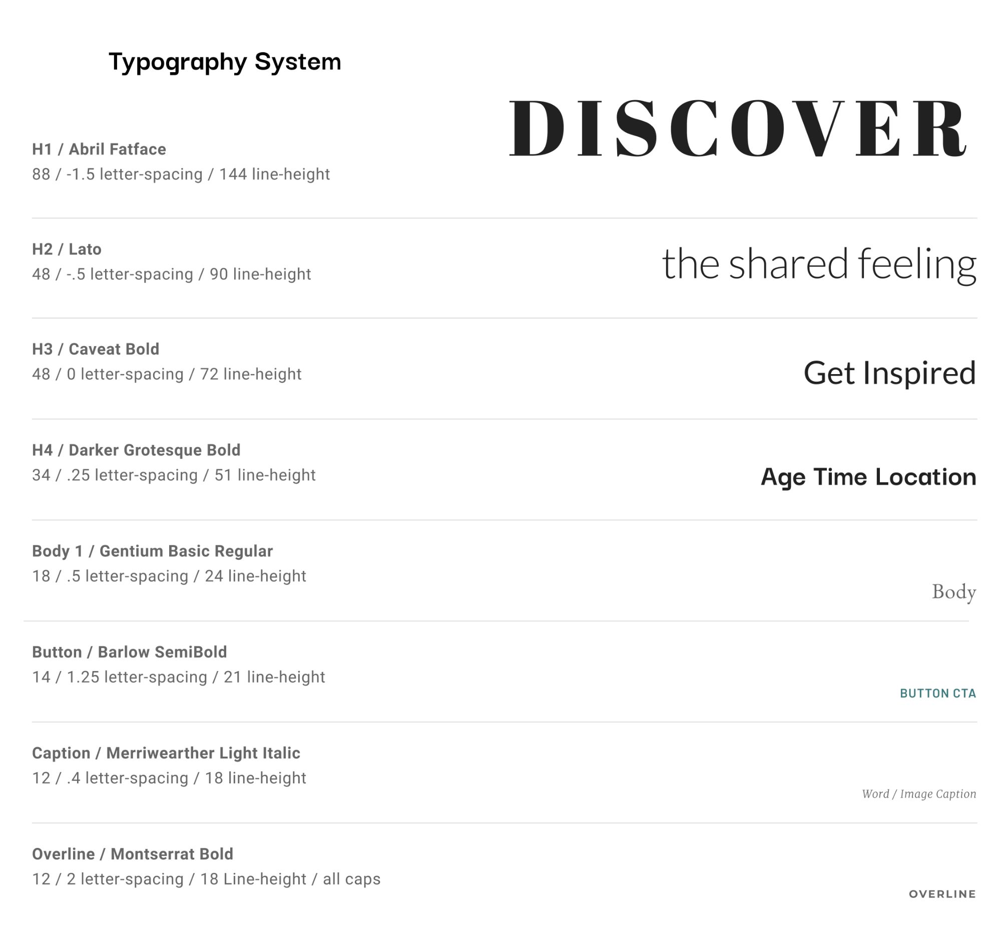
typography system
Due to the text-heavy nature of the platform, we developed a comprehensive typography system for the various texts serving different purposes.
Reflection
This is a project that I'm personally attached to. I love the problem space and I wish we had more opportunity to research and talk to more people about what might be able to help them. Nonetheless, the design and the overall aesthetics of the landing page also gives me a lot of pride after the unsatisfactory low-fidelity prototype. One aspect of the website - the visualization of various stories wasn't prototyped due to time constraints. Luckily, I'm currently working on a project focusing on the missing piece of generating and visualizing stories. I learned in the process to continue pushing for changes, never settle for the first "solution". Something amazing will be created if we continue iterating the project.

